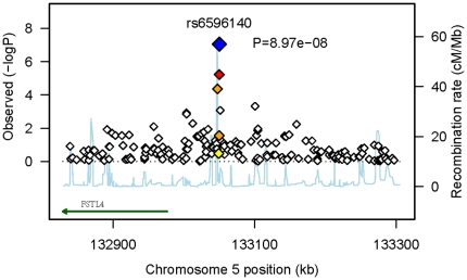
Figure 1. Regional plot of the strongest association for dichotomous hypertension.
The plot highlights the statistical strength of the strongest association (rs6596140, P<9×10⁻⁸, blue diamond) and surrounding markers, along with the pair-wise correlations between the surrounding markers and the putative associated variant, indicated by color. All SNPs in the region are plotted with their p-values (as –log10 values) as a function of genomic position (using NCBI Build 36). Estimated recombination rates (taken from HapMap) are plotted to reflect the local LD structure around the associated SNP and their correlated proxies (bright red indicating highly correlated, faint red indicating weakly correlated). The annotated gene FSTL4 (taken from UCSC table browser) is more than 70 kb away from the associated SNP.

