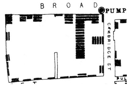
Figure 1.

Map of the 1854 London cholera outbreak. The pump is indicated by a circle in the upper right hand corner of the figure. Deaths from cholera in each household are indicated by bars. Reprinted with the very kind permission of Dr. Ralph Frerichs from his John Snow website, http://www.ph.ucla.edu/epi/snow/mapsbroadstreet.html.
