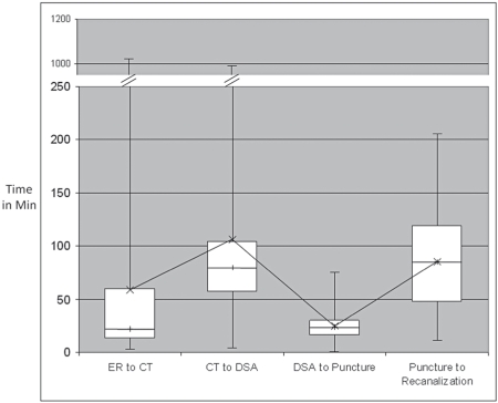
Figure 1.
Box plot showing time in minutes and variability of ER to CT time, CT to DSA suite arrival time, DSA to puncture time and puncture to recanalization time. The boxes represent the inter-quartile range, the line within each box represents the median and the interconnected x represents the mean. Note the difference between mean and median for the first two intervals, representing dispersion.

