
Figure 1.
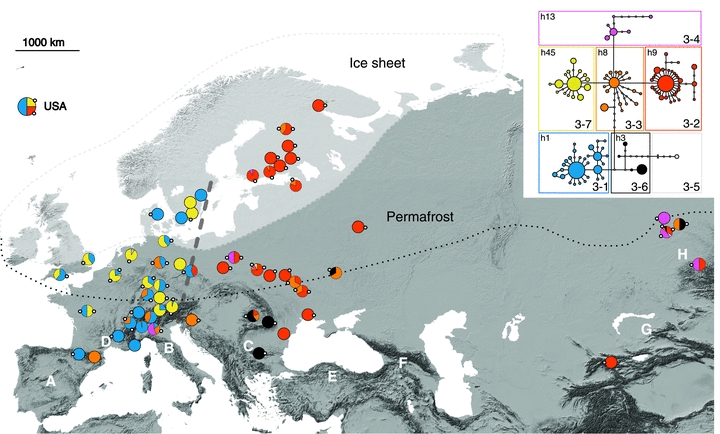
Haplogroup distribution map with haplotype network of Figure 3. Dashed line represents west–east division of haplogroups, white area approximates limit of ice sheet (Svendsen et al. 2004) and dotted line that of permafrost during the last glacial maximum (Renssen and Vandenberghe 2003; Saito et al. 2009). Potential refugia of M. rubra shown with white letters: A = Iberian Peninsula, B = the Apennine Peninsula, C = the Balkans, D = southern France, E = Turkey, F = the Caucasus, G = Middle Asia, H = Siberia. Pie charts show proportions of third-level haplogroups in their respective colors of haplotype network; size of pie chart is not proportional to sample size. A single pie chart represents one location, except for following combined neighbor-population sets separated by semicolon (population numbers in Table 1): 2, 39; 6–8; 9–10; 11, 16, 21–24; 14–15; 18, 20; 28, 29; 35, 38; 40–46; 50, 52; 53, 54, 56; 55, 58; 59, 65; 62, 63; 69, 72; 70, 74; 77–79; 81–82; 83, 87; 88–90, 92–93; 94–95. Local occurrence of common, central haplotype and its haplogroup identity is shown by small white circle at periphery of pie chart; identity number of each central haplotype is given in haplotype network insert, at upper left corner of its third-level haplogroup box.