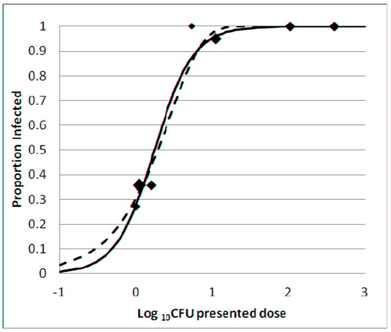
Figure 3. Proportion of mice infected based on presented dose.

Aerosol exposure groups A-G are described in Tables 1 and 2. The area of each data point is proportional to the total number of mice in the group. Curves were plotted based on a sigmoid dose-response (solid line) and a Poisson distribution (dashed line) as described in Methods. The best-fit curves were determined by weighted least squares.
