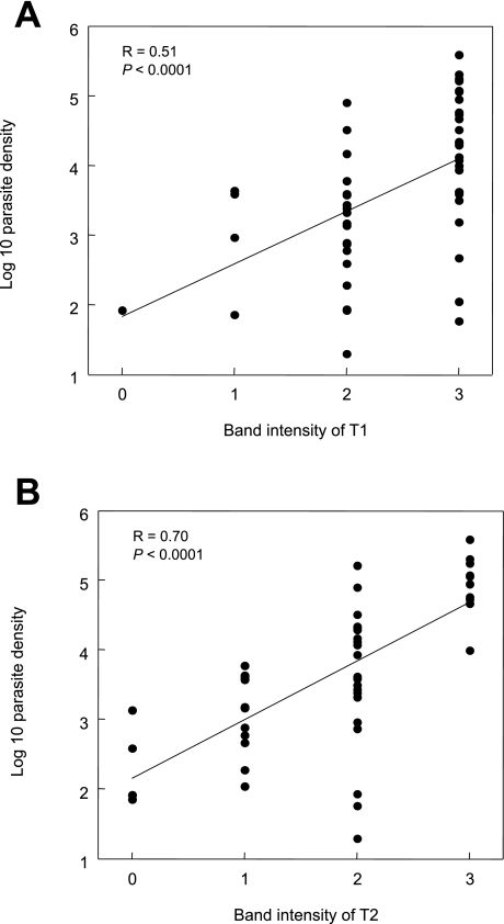
Fig. 2.
Comparison of T1 and T2 band intensity read by the ICT test window and Pf density of each blood sample.
The T1 band is shown in (A). The T2 band is shown in (B).
Each dot indicates a single data point.
Linear regression and Pearson product-moment correlation coefficient (R) are indicated in each field.

