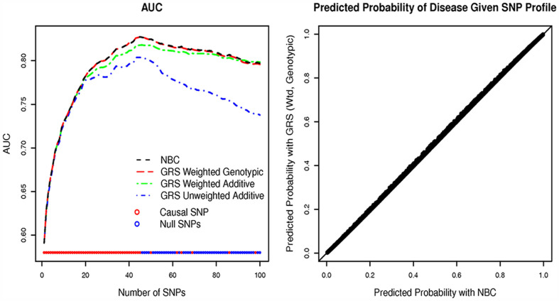
Figure 3.
Results of simulation for replication set. The left hand plot graphs the mean area under the ROC (AUC) versus the number of SNPs in the prediction model. The colored lines refer to the AUC of the NBC (black), the unweighted GRS from an additive model (case 1, blue), the weighted GRS from an additive model (case 2, green), and the weighted GRS from a genotypic model (case 3, red). The maximum AUC occurs at 45 SNPs. The right hand plot graphs the probability of the trait T given the weighted GRS (genotypic model) on the y-axis versus the probability of disease given the SNP profile estimated by NBC on the x-axis for a model containing 45 SNPs for one of the replicates. The right hand plot is similar across the five replicates.

