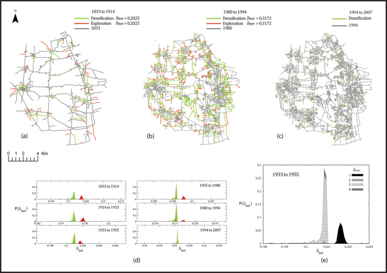
Figure 5.
The two phases of densification (green) and exploration (red), illustrated for the networks at year 1914 (a), 1994 (b) and 2007 (c). Panel (d) shows the probability distribution of the BC impact δb(e) for the different time snapshots. The red peak corresponds to exploration, and the green peak to densification. Notice that the red peak becomes smaller and smaller with time, and completely disappears in the last snapshot. (e) Stacked chart showing the proportion of new links with a certain value of kmin for each value of δb in the network at t = 1955. The peak corresponding to exploration with a high BC impact is entirely due to links having kmin = 1.

