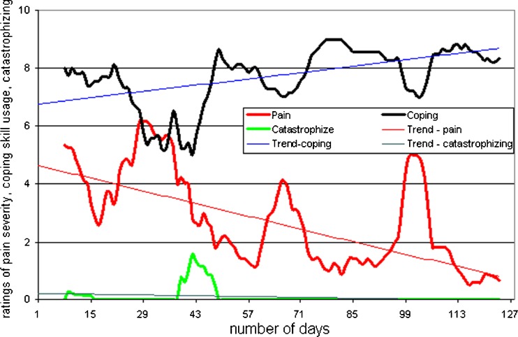
Fig 2.
Single subject daily TIVR data: an example of an IVR daily data chart depicting trends in and relationships between pain, coping, and catastrophizing over a 4-month calling period (7-day moving averages). Currently, these charts are utilized by the clinician to monitor patient symptom progression and create feedback messages. In the future, graphs like this might also be sent to patients via email or smartphone applications for visual emphasis of treatment progress

