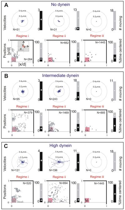
Figure 5. MT aster positions and movements.
(A,B,C) Data are shown for the same conditions and regimes as displayed in Figure 4DEF. Top: rosette plots show the magnitude and the direction of velocity of all moving centrosomes. The velocity was determined over 15 s time intervals. The directions are binned into 16 angles. The lengths of the arrows indicate the average velocity in that direction for all time intervals, where N is the total number of time intervals per condition. The stacked bar plots show the number of centrosomes that moved (black, +). Bottom: scatter plots of all aster positions, normalized with d, plotted in one quadrant of the chamber, as indicated in the left-most plot in A (N is the total number of time points, n the number of asters). Aster positions within the small pink square are considered centered. Grey dot indicates one time point; black point indicates more than 10 time points at the same position. Mean positions and standard deviations are given in Table S2. The stacked bar plots show the percentage of time that centrosomes were centered (black, +).

