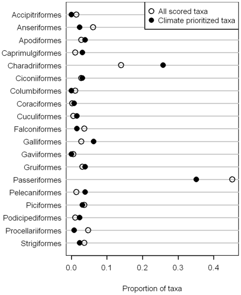
Figure 3. Proportion of taxa in each avian order that were on the full nominated list (hollow circles) compared with the proportion (of those on the full list) that were classified as climate vulnerable (solid circles).
Orders for which the distance between the two circles is larger are ones that had a higher proportional vulnerability from climate change.

