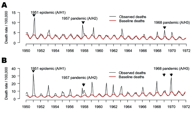
Figure 2.
Time series of monthly mortality from pneumonia and influenza (P&I, represented as death rate/100,000) from 1950 to 1972 in A) Canada and B) England and Wales. Black line: observed deaths, Red line: baseline deaths predicted by a seasonal regression model. Note the 2 arrows for the 1968 pandemic in England, representing the 2 waves of the smoldering A/H3N2 pandemic (1968–69 and 1969–70, respectively) (18).

