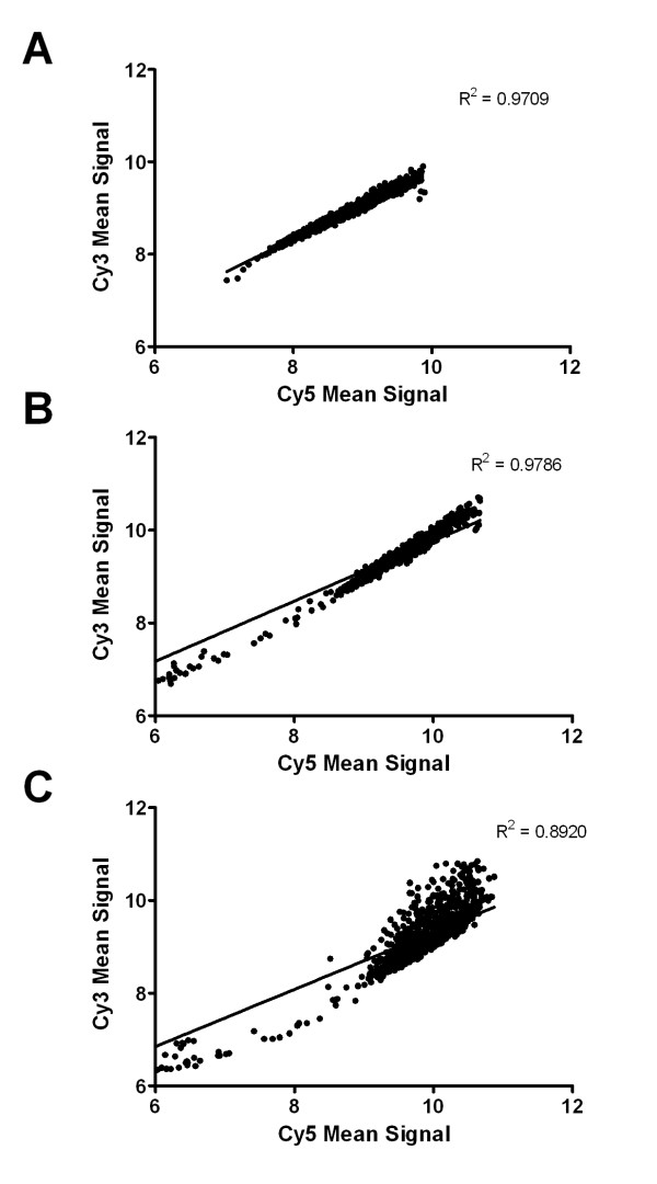
Figure 1.
Scatter plots demonstrating the degree of variance between different sample hybridisations. Scatter plots were constructed from the raw non-normalised, transformed (natural log) array data, averaged for each comparison from the four hybridisations (2 dye-swapped (Cy3/Cy5) replicates each). A. Self vs self hybridisation (Fed P. ovis control vs fed P. ovis control). B. Biological replicates (replicated analysis of fed P. ovis control vs starved P. ovis, compared using two separate dye swapped arrays). C. Activated sample vs control sample (starved P. ovis vs fed P. ovis control). Scatter plots, linear regression analysis and corresponding R2 values were generated in GraphPad Prism (GraphPad Software Inc, Version 5.04).

