Fig. 1.
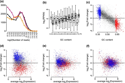
Exploratory plots. (a) The points show the frequency of counts in the bins shown on the x-axis. The 3 colors represent 3 samples (NA12812, NA12874, and NA11993) from the Montgomery data. (b) log2-RPKM values are stratified by GC-content for 2 biological replicates from the Montgomery data (NA11918 and NA12761) and are summarized by boxplots. The 2 samples are distinguished by the 2 colors (colors can be seen in the online version). Genes with average (across all 60 samples) log2-RPKM values below 2 are not shown. (c) Log fold changes between RPKM values from the 2 samples and the same genes shown in (b) were computed and are plotted against GC-content. Red is used to show the genes with the 10% highest GC-content and blue is used to show the genes with the 10% lowest GC-content. (d) RPKM log fold changes are plotted against average log2 counts for the samples and genes shown in (b), with the same color coding as in (c). (e) As (d) but from values corrected using the method proposed by Pickrell and others (2010). (f) As (d) but for values normalized using our approach (see Section 4).

