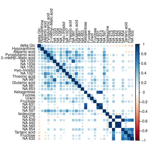
Figure 1.
Correlation matrix. This correlation matrix visualises not only the significant correlations between Δ glucose and the metabolites (first row/column) but also the correlation among the metabolites. The colour intensity and tile size indicate the strength of correlation. Positive correlation are marked blue, negative correlation are marked red.

