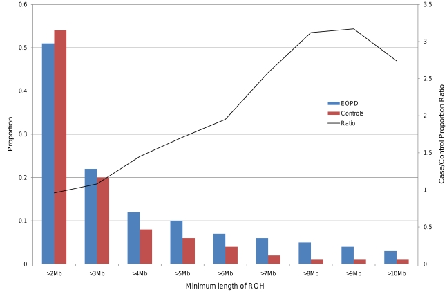
Figure 1. Number of rare ROHs at different size thresholds in EOPD and control groups.
In this bar plot the average number of rare ROHs per person (rate) in either EOPD (red) or control (blue) groups is shown for different minimum size thresholds. The black line represents the ratio of average rate in cases vs. average rate in controls. Differences were statistically significant from a threshold of 2 Mb (0.91 vs. 0.82, ratio: 1.09, p = 0.01) and remained strongly significant throughout, peaking at 9 Mb (0.04 vs. 0.01, ratio: 3.17, p<1.00×10⁻⁸.

