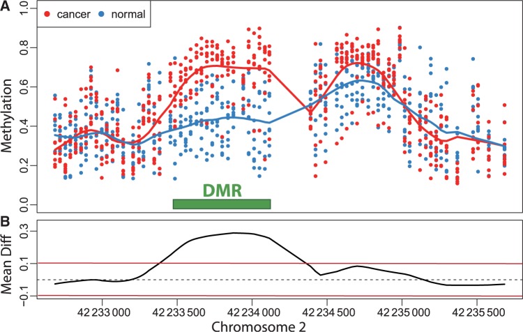
Figure 1.
Example of a differentially methylation region (DMR). (A) The points show methylation measurements from the colon cancer dataset plotted against genomic location from illustrative region on chromosome 2. Eight normal and eight cancer samples are shown in this plot and represented by eight blue points and eight red points at each genomic location for which measurements were available. The curves represent the smooth estimate of the population-level methylation profiles for cancer (red) and normal (blue) samples. The green bar represents a region known to be a cancer DMR.20 (B) The black curve is an estimate of the population-level difference between normal and cancer. We expect the curve to vary due to measurement error and biological variation but to rarely exceed a certain threshold, for example those represented by the red horizontal lines. Candidate DMRs are defined as the regions for which this black curve is outside these boundaries. Note that the DMR manifests as a bump in the black curve

