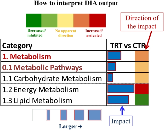
Figure 1. Visual explanation for interpretation of the Dynamic Impact Approach output.
On the extreme left are reported the biological terms (in the present figure it is reported, for instance, the main categories of KEGG pathways). On the right of the column with the biological term is the column of the comparison considered. The column presents two sub-columns. In the left sub-column it is reported the horizontal blue bar that denotes the overall impact of the differentially expressed genes on the biological term. Larger the horizontal bar larger the impact. In the right sub-column it is reported a colored square that denotes the direction of the impact (green = inhibited/decreased; red = activated/increased). Darker the color larger the activation (if red) or inhibition (if green) of the biological term.

