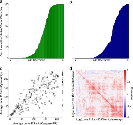
FIG. 3.
The percent of cell lines exhibiting activity for each chemical for cytotoxicity (panel a) and caspase-3/7 (panel b) assays. Panel c displays the rank of the mean ATP curve P value versus the mean caspase curve P value for each chemical. Panel d shows a heatmap of the correlations between log (curve P) values for all chemical-assay combinations.

