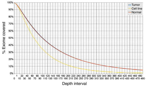
Figure 1.
Cumulative WDPMP exome coverage for the tumor, normal sample and tumor derived cell line. Cumulative exome coverage curve for the tumor (blue), normal sample (orange) and cell line (yellow) is generated by plotting the percentage of the exome represented by different read depths where read depth is defined as the number of individual 75-bp sequenced reads mapped to a particular exome position. The 'fat tail' of the graph indicates a bias in the capturing technology as small sections of the exome are over-represented.

