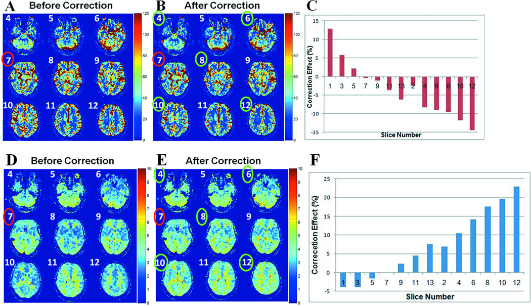
Figure 6.
A and B are qCBF maps (in ml/100 g/min) for slices numbered 4 through 12, in a representative subject, before (SVD) and after (eSVD) applying the correction algorithm, respectively. C) Bar plot of the correction effect, measured as a percent change in mean qCBF value in each given slice due to the correction, when moving away from the slice where the AIF was selected (slice #7), based on the interleaved order of slice acquisition. D and E are MTT maps (in seconds) for slices numbered 4 through 12, for the same subject as in A and B, before (SVD) and after (eSVD) applying the correction algorithm, respectively. F) Bar plot of the correction effect, measured as a percent change in mean MTT value in each given slice due to the correction, when moving away from the AIF slice, based on the interleaved order of slice acquisition. The AIF slice is marked in red, and the slices where the correction effect is greatest are marked in green.

