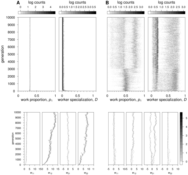
Figure 2. Feedforward neural networks: Evolutionary dynamics of two representative simulations, for.
 ½ and
½ and
 . Grey scales indicate log counts of colonies with the corresponding value of
  ,
,  (scales on top of the respective graphs) and connection weights (scale on the bottom right-hand side). (A) No switching costs (c = 0). Top graphs:
  decreases to approximately 0.3. Worker specialization remains at zero. Bottom graphs: incoming connection weights at output node 2 evolve to strong positive values, whereas incoming connections weights at output node 1 evolve to weak positive values (
 ) or oscillate around zero (
 ). (B) With switching costs (
 ). Top graphs: the distribution of workers over tasks and the degree of worker specialisation are both highly variable across colonies. At the end of the simulation,
  and
and  are both bimodally distributed. Bottom graphs: one of the connection weights (
 ) branches, one branch having positive values and the other, negative values. All other connections show weak positive values or remain very close to zero, all being relatively homogeneous in the population.

