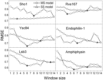
Figure 3. Comparison of the prediction errors between two computational models.
The prediction errors from the MS and SS models are plotted as circles and triangles, respectively, and the points with the lowest prediction error are marked as solid circles and triangles. In this figure, the RMSE denotes the normalized prediction error against the experimental values.

