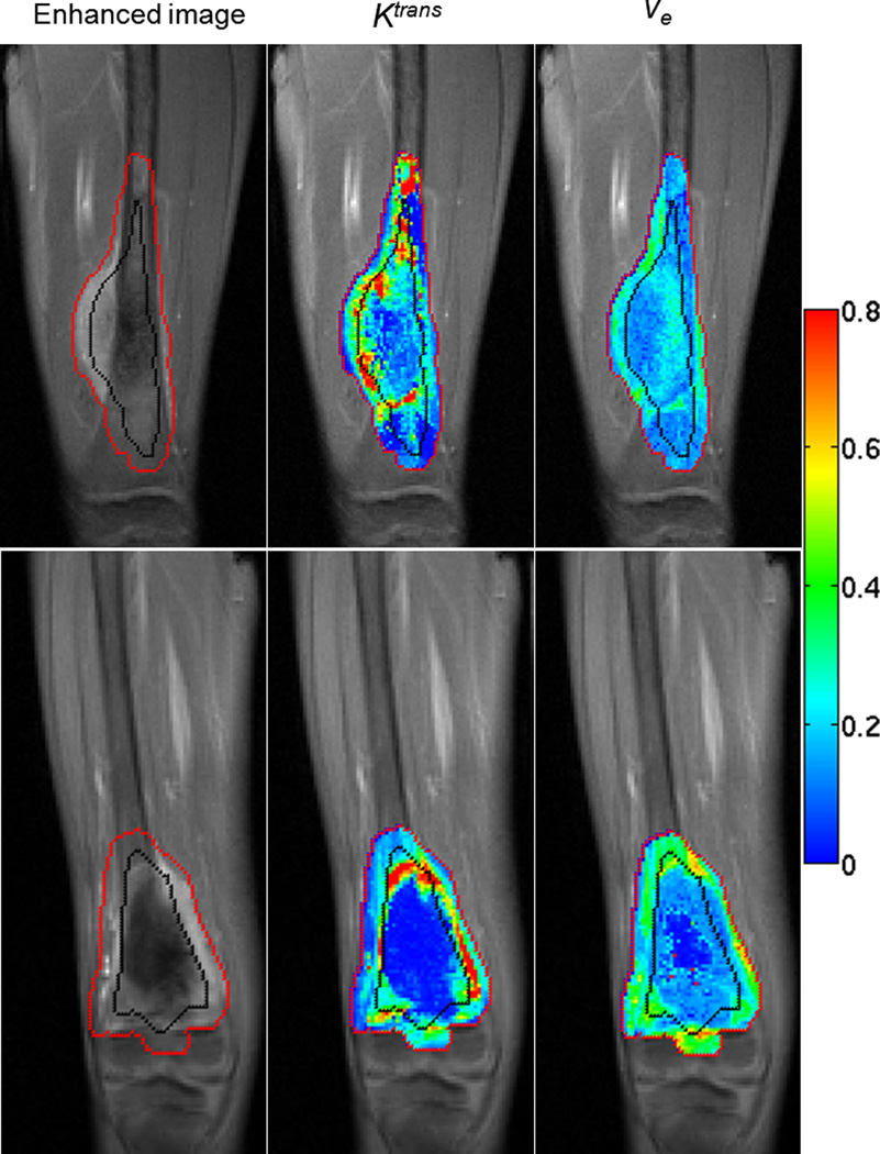
Figure 2.
The contrast-enhanced image, Ktrans map, and ve map in baseline examination are displayed from left to right. The red line is the boundary of tumor ROI drawn by a radiologist, and the black line was automatically generated to divide each tumor ROI into inner and outer halves. Images in the upper row are for a patient who was a responder and was alive without event at the time of analysis; images in the lower row are for a nonresponder who died after disease relapse. All the grayscale images are in the same gray scale. All the color maps are in the same color scale, and the color bar is displayed on the right.

