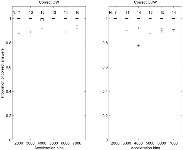
Figure 2.
Box plot representation of the distribution of correct answers ratios per acceleration bin, in control subjects. Each acceleration bin is labeled using the lower acceleration threshold, e.g., the 2000 deg/s2 bin includes accelerations in (2000, 2999). In each box plot the thick horizontal line indicates the median of the sample, and the thin line at the lower extremity of the box the 25th percentile. Whiskers extend to the extreme data points considered in the distribution, while crosses indicate individual outlier data points.

