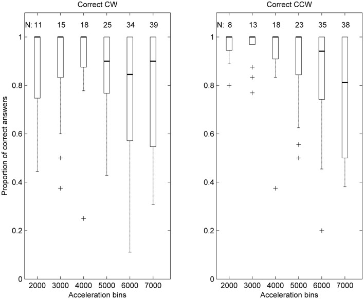
Figure 3.
Box plot representation of the distribution of correct answers ratios per acceleration bin, in patients. Data is represented as in Figure 2, with the addition that the thin line at the upper extremity of the box represents the 75th percentile.

