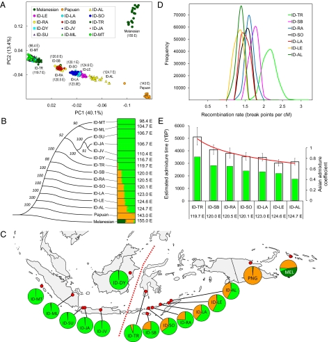
Fig. 1.
Analyses of the Pan-Asian SNP dataset. (A) PCA of individuals representing 15 populations. A plot for the first two principle components is shown. Individuals are shaded by different colors according to their population affiliation. Numbers in parentheses indicate the longitude of each population sample. (B) Phylogenetic analysis of 15 populations and estimated population structure. (Left) An unrooted phylogenetic tree shows genetic relationship of the 15 populations using the neighbor-joining method on pairwise FST matrices. Bootstrap values based on 1,000 replicates are also shown. (Right) A plot shows the estimated population structure, with each colored horizontal line representing an individual assigned proportionally to one of the K = 3 clusters with the proportions represented by the relative lengths of the three different colors. Black lines separate individuals from different populations. Populations are labeled on the left by lines connecting to the nodes of the tree. The longitude of each population sample is displayed on the right of the figure. The results shown were based on the highest probability run of 10 STRUCTURE runs at K = 3. (C) Geographical distribution of genetic components. Red dots on the map are sampling locations. Each circle graph represents a population sample, with the frequency of the three genetic components inferred by STRUCTURE analysis (B) indicated by the colored sectors. Red dashed line denotes Wallace's biogeographic line. (D) Posterior distribution of the recombination parameters for seven Eastern Indonesian populations showing admixture. Posterior distribution of the recombination parameter r (breakpoints per centimorgan) estimated by STRUCTURE analysis is indicated with colors for populations as shown in the legend. The mean and 90% CI of r for each population are shown in Table 3. (E) Estimated admixture time in seven Eastern Indonesian populations. White bars indicate estimated admixture times with 90% CIs (scale on the left y axis); color bars denote the admixture proportion (fraction of Asian ancestry) in each population as indicated by the y axis on the right.

