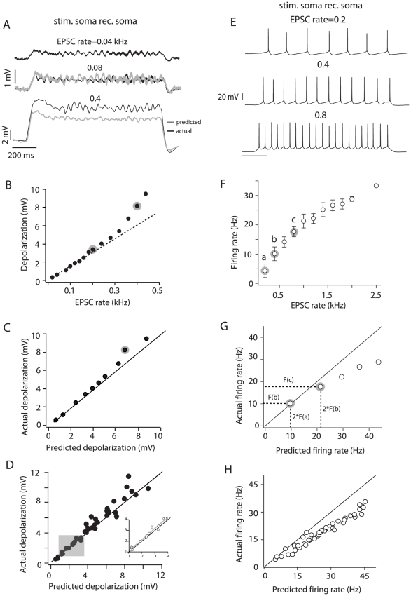
Figure 2. Integration at the soma.
A, top voltage trace is the average depolarization obtained by injecting an input barrage with an EPSC rate of 0.04 kHz. This response was doubled to calculate the predicted depolarization when the input rate is doubled (0.08 kHz). The predicted response is overlaid with the actual response (gray and black middle traces, respectively). The bottom traces compare the actual and predicted responses at a higher input rate. B, Depolarization vs. input rate relation for the cell shown in A. The responses to 0.2 and 0.4 kHz (black bottom trace in A) are highlighted in gray. The dashed line is a linear fit through the first 7 data points. C, Actual vs. predicted depolarization for the cell shown in A and B. The point highlighted in gray corresponds to the actual depolarization measured at an input rate of 0.4 kHz and the prediction from doubling the response to 0.2 kHz (points highlighted in B). D, Population plot of the actual vs. predicted depolarization (n = 19). Shaded area corresponds to expanded data points (insert) and highlights responses between 2–4 mV. E, Summation of suprathreshold inputs at the soma (different cell from that shown in panels A–C). F, Firing rate vs. EPSC rate plot (± S.D.) for the cell shown in E. The firing rates marked a, b, c correspond to the spike trains in A, respectively. G, Actual vs. predicted firing rate for the cell shown E and F. The points highlighted correspond to the actual and predicted firing rates for points b and c in F. H, Population plot (n = 15) for suprathreshold integration at the soma. The solid black line in some plots represents the unity slope.

