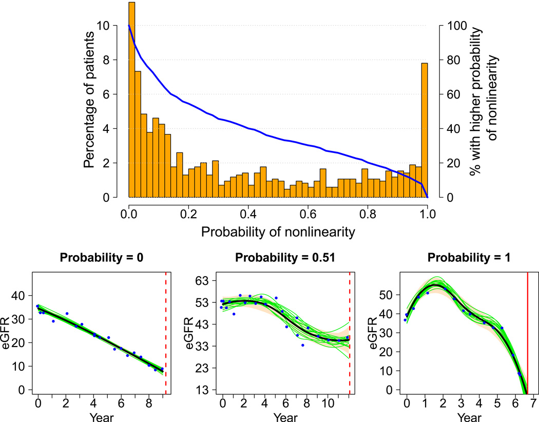
Figure 1.
Distribution of the probability of nonlinearity, visualized by a percentage histogram (columns drawn to the scale of the vertical axis on the left), and a curve of the proportion of patients in the study sample (n=846) with higher probability (blue curve drawn to the scale of the vertical axis on the right). Below are three example trajectories with probabilities close to 0, 0.5, and 1. These were selected to illustrate the increasing oscillation as the probability of nonlinearity increases. On each trajectory plot, the horizontal axis is year since randomization, and the vertical axis is eGFR (mL/min/1.73m2). The blue dots are eGFR data, the black smooth curve is the estimated trajectory, and the bisque color band is the pointwise 95% Bayesian confidence interval. The red vertical line represents time of either censoring (dashed) or dialysis (solid). Fifteen of the 3,000 Monte Carlo trajectories are randomly selected and plotted for illustration (green curves).

