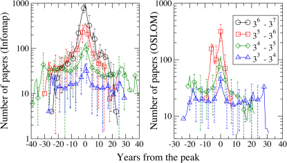
Figure 6. Evolution of average size of clusters.
The time ranges of the evolution of the communities have been shifted such that the year when a cluster reaches its maximum is 0. The two panels show the results obtained with Infomap (left) and OSLOM (right). The data are aggregated in four bins, according to the maximum size reached by the cluster. The phases of growth and decay of fields appear rather symmetric.

