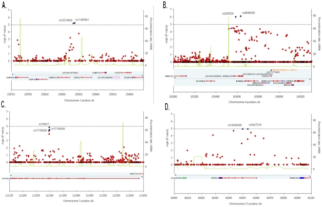
Figure 2. Refined regional association plots.
For each plot of the four clusters ((A) SLAMF1, (B) NFKB1, (C) DOCK4, and (D) RIPK4), the −log10 P values for the trend test from Affymetrix SNP 6.0 Array in 522 cases and 806 controls are plotted as red diamond according to their genomic position (NCBI Build 36.3). The SNPs with the strongest signal are represented as blue diamonds. The recombination rates (right y-axis) based on the Chinese HapMap population is plotted as green lines to reflect the local LD structure around the SNPs. The dashed horizontal line indicates a P-value of 10−5.

