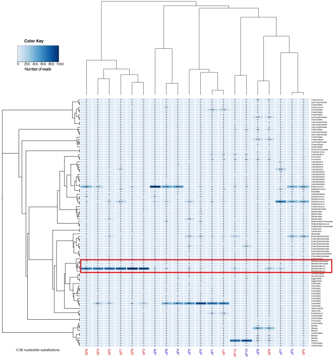
Figure 2. Heatmap displaying the relative abundance of OTUs per sample.
Samples are grouped by hierarchical cluster analysis on the x-axis and by neighbour-joining phylogenetic tree with nearest neighbour interchange on the y-axis. Samples amplified with ‘bifidobacteria-optimised’ primers are in red and with the standard primers in blue. Bifidobacterial OTUs are highlighted in the red box.

