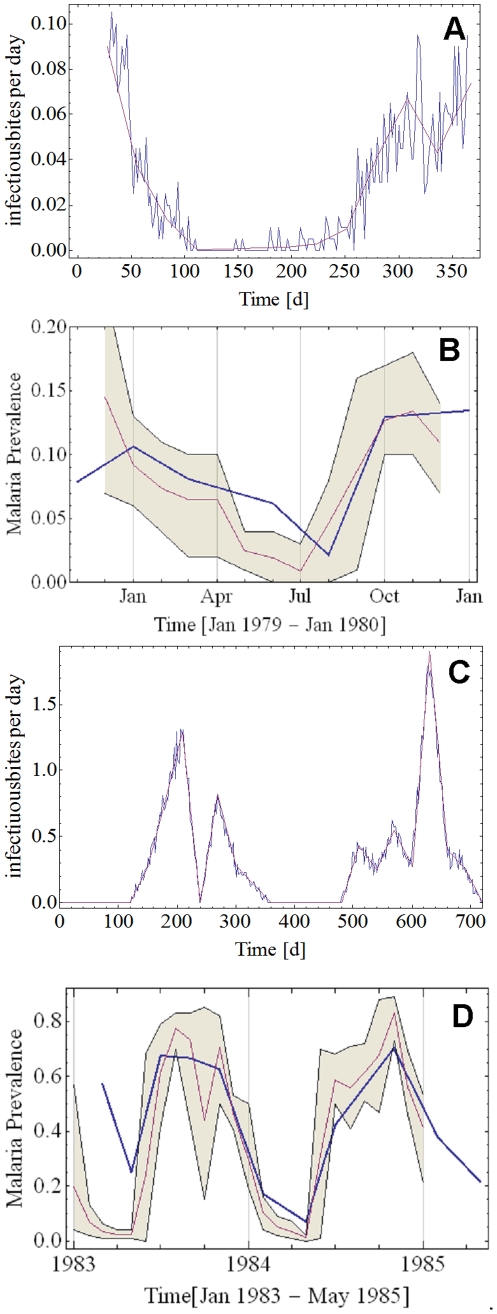
Figure 9. Comparison of model prediction to field observations from areas of seasonal malaria transmission.
Panel A: EIR as reported by Vercruysse [34] (solid purple line), and reproduced as input for the model (solid blue line). Panel B: Malaria prevalence as reported by Vercruysse (solid blue line) and model prediction as monthly average (solid purple line) and envelope of monthly minima and maxima (olive fill) using as input the EIR pattern from Panel A. Panel C: EIR as reported by Gazin [35] (solid purple line), and reproduced as input for the model (solid blue line). Panel D: Malaria prevalence as reported by Gazin (solid blue line) and model prediction as monthly average (solid purple line) and envelope of monthly minima and maxima (olive fill) using as input the EIR pattern from Panel C.

