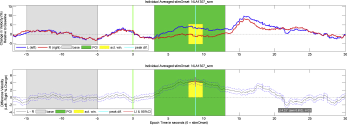
Fig. 5.
Example of an average graph produced by dopOSCCI. These are based upon word generation data from a single individual, averaged across 23 trials. The upper panel displays the left and right baseline corrected percentage change in blood flow velocity and the lower panel displays the difference between the left and right baseline corrected blood flow velocities. The baseline runs from −15 to −5 s relative to the visual letter presentation, and the period of interest (POI) runs from 3 to 13 s following the visual letter presentation. The time point of the peak difference is displayed in both panels, surrounded by a 2-s activation window across which the laterality index (LI) is calculated. In the lower panel, the 95% confidence interval of the LI calculations is also displayed along with the LI value, the LI standard error of the mean, and the number of epochs averaged within the graph.

