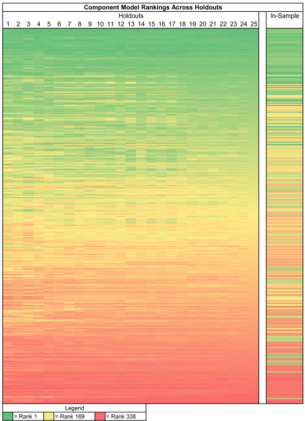
Figure 3.
Heatmap of stability in maternal mortality component model rankings. Each row represents a component model, and each column corresponds to how many hold-outs are used when ranking. Rows are sorted by rankings using all 25 hold-outs. Cells are colored based on their ranking, with the green models being the best and red the worst. The last column displays in-sample ranks. The figure shows that rankings stabilize as hold-outs increase, and that in-sample ranking does not correlate well with out-of-sample.

