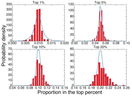
Figure 4. Comparison between expected and observed proportions of top cited papers.
Probability density function of the proportion of papers belonging to a particular subject-category and that are part of the top  of papers in the aggregated dataset. Red boxes are computed on real data, while blue curves represent the density distributions valid for unbiased selection processes. We consider different values of
  :
:  ,
,  ,
,  and
and  . These results refer to papers published in
  .
.

