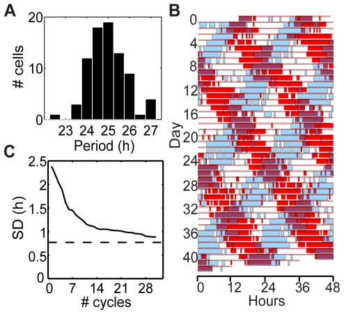
Figure 2. Analysis of cell periods.
(A) Histogram of cell periods (mean peak-to-peak times). (B) Raster plot showing two cells with clearly different periods. In the raster plot, time of day is plotted left to right and successive days down the page, such that vertically adjacent points are 24 h apart. Each row is extended to 48 h, duplicating data in the next row, so that patterns crossing midnight can be appreciated. Thick bars designate times when the luminescence for a cell was above the mean for each row. Cell #66 with period 25.5 h is plotted in red; cell #68 with period 22.5 h is plotted in blue. Due to different circadian periods, the two cells' phase relationship changes over time. (C) Standard deviation in period over the population of cells as a function of the number of cycles used for period determination. Here period for each cell is calculated as the mean of peak-to-peak times over the indicated number of cycles. This curve is expected to decrease to the true value in proportion to one over the square root of the number of cycles used. The dashed line shows the ANOVA prediction of the true value of the standard deviation in period among the fibroblasts. Note that if all cells had the same intrinsic period, and variability of observed period was only due to stochastic fluctuations, then we would expect this graph to approach zero, rather than having a positive horizontal asymptote.

