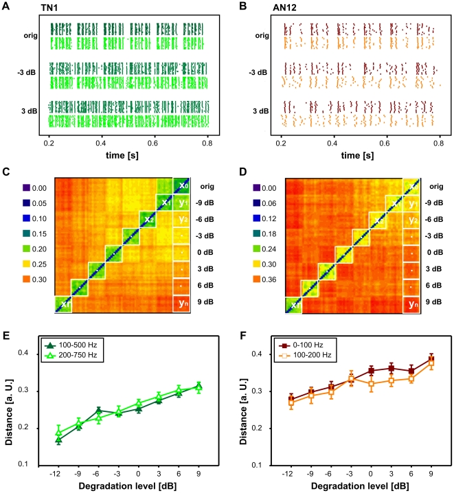
Figure 4. Quantification of the spike train degradation due to different envelope maskers.
A) Spike train patterns from the local interneuron TN1 in response to the original song, −3 dB and 3 dB signal degradation. The degradation with 100–500 Hz is shown in dark green (upper traces). The degradation with 200–750 Hz is shown in light green (lower traces). B) Spike train patterns from the ascending interneuron AN12. Again, the responses to different envelope maskers are colour coded (0–100 Hz in dark red, 100–200 Hz in orange). C) Distance matrix of the TN1 for 100–500 Hz signal degradation. Metric distances are colour coded from blue to red (low to high distance). Square blocks along the diagonal contain the intrinsic distance values for each degradation level (e.g. x0: distances between spike trains in response to the original song). Squares along the right column indicate extrinsic distance values (e.g. y1 for distances between spike trains in response to the original song and the first degradation level). (Distances were normalized by the respective mean spike counts, see Material and Methods.) D) Distance matrix of the AN12 in response to 0–100 Hz signal degradation. E) Average values (± standard deviation) of spike train distances between spike trains in response to the original song and progressively degraded songs for the TN1. The abscissa shows the degradation level in dB, the ordinate the spike train distance in arbitrary units. Again, the distance curves for two different envelope maskers are shown in the same colours as in A (see inset). F) Distance curves for the AN12.

