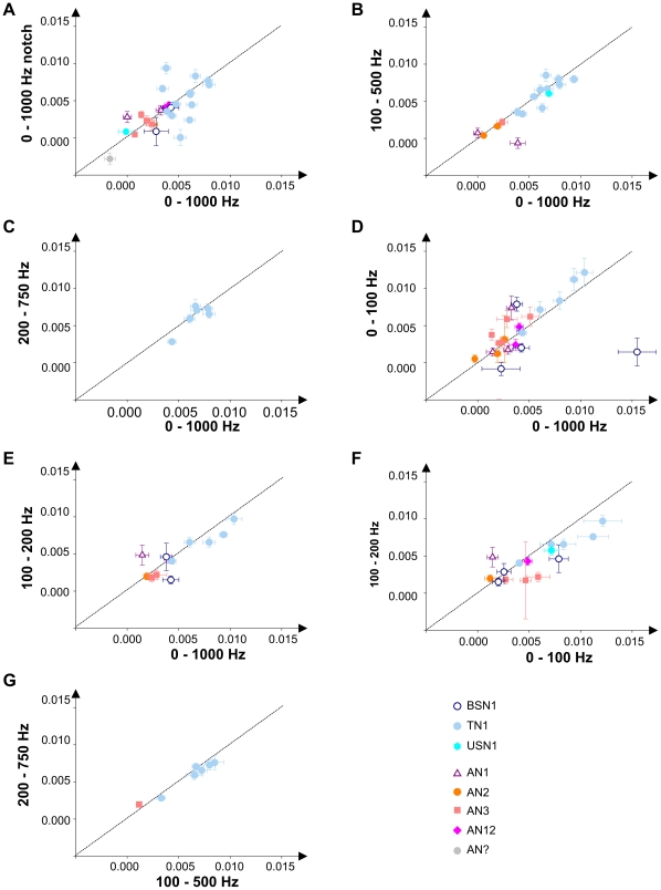
Figure 5. Comparison of the influence of different envelope maskers on neuronal representation.
The graphs show the slopes of the distance curves (as in Fig. 4 E,F) of single cells, which were tested with different envelope maskers. Error bars indicate the mean standard error (s.e.m.) of the linear regression, each point in a graph represents a single neuron. The different cell types are indicated by different symbols (see inset). A) 0–1000 Hz vs. 0–1000 Hz notch, LN: 18, AN: 9; B) 0–1000 Hz vs. 100–500 Hz, LN: 12, AN: 5; C) 0–1000 Hz vs. 200–750 Hz, LN: 7; D) 0–1000 Hz vs. 0–100 Hz, LN: 9, AN: 13; E) 0–1000 Hz vs. 100–200 Hz, LN: 7, AN: 5; F) 0–100 Hz vs. 100–200 Hz, LN: 9, AN: 6; G) 100–500 Hz vs. 200–750 Hz, LN: 7, AN: 1.

