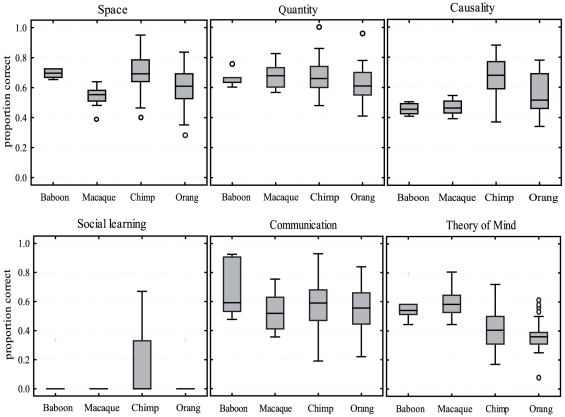
Figure 2. Comparison of species.
Shown are the proportions of correct responses on the scale level for the four different primate species. Boxes show the interquartile range from the 25th to the 75th percentile. The line across the boxes represents the median. The whiskers indicate the maximum and minimum values excluding outliers (circles) and extreme values (crosses).

