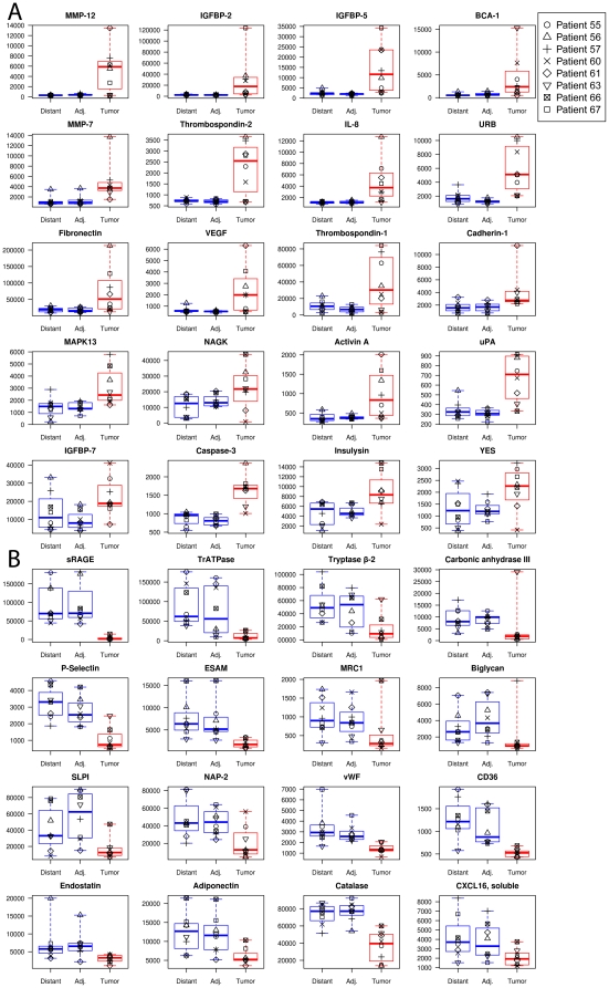
Figure 3. Box plots of SOMAmer signals in the tissue homogenates.
Proteins with increased (panel A) or decreased (panel B) levels in tumor tissue compared with adjacent or distal tissue (panel A) from eight NSCLC samples used in this study. Each individual is indicated with a different symbol. The horizontal lines of each box correspond to the first, second, and third quartiles (25%/50%/75%) and the whiskers correspond to the maximum and minimum values.

