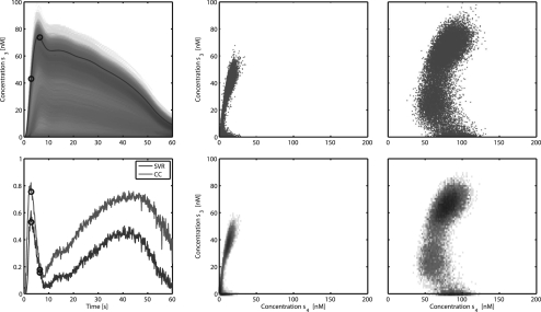
Fig. 3.
Top left: one simulated time course of state 3 superimposed on the PPD. Two time points are indicated with circles. Bottom left: correlation coefficient between states 3 and 4 and SVR of state 4 based on a measurement of state 3 (SVR). The relation between the two states at the indicated time points is shown in both scatter plot and 2D histogram form. The former shows the actual samples from the PPD for one point in time. Here the dots represent simulated values belonging to different parameter sets from the MCMC chain. In the histogram the colour indicates the number of samples in a particular region which is proportional to the probability density.

