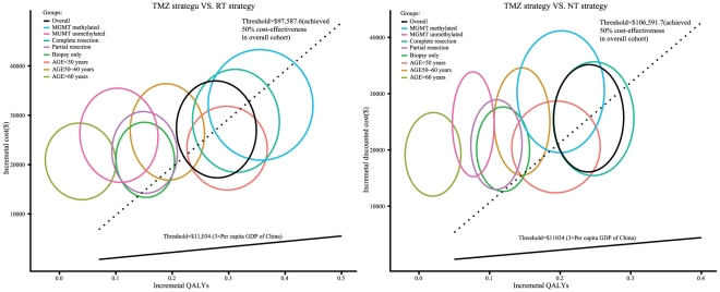
Figure 4. The probabilistic results of the incremental cost-utility differences for GBM in the overall cohort and the 8 subgroups.
The TMZ strategy was compared to: (A) the RT strategy and (B) the NT strategy for a cohort of 1,000 GBM patients. The y-axis represents the incremental costs. The x-axis represents the incremental QALYs gained. Each ellipse represents the 95% confidence interval ellipse of the probabilistic results. The proportion of the ellipses found below the ICER threshold (the oblique lines) reflects the simulations in which the cost per additional QALY gained with the TMZ strategy was below the ICER threshold.

