
Figure 6. API trends by environment type.

Boxplots show the proportional annual change of yearly pollen sums for different environments. Mann-Whitney tests show a significant increase (median different from zero,  ) of airborne pollen in urban environments. The notches are calculated as
 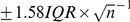 and the height of each boxplot is related to sample size. On the right, the percentages of significant trends are indicated for each type of environment (of which the percentages of positive trends are given in parentheses).