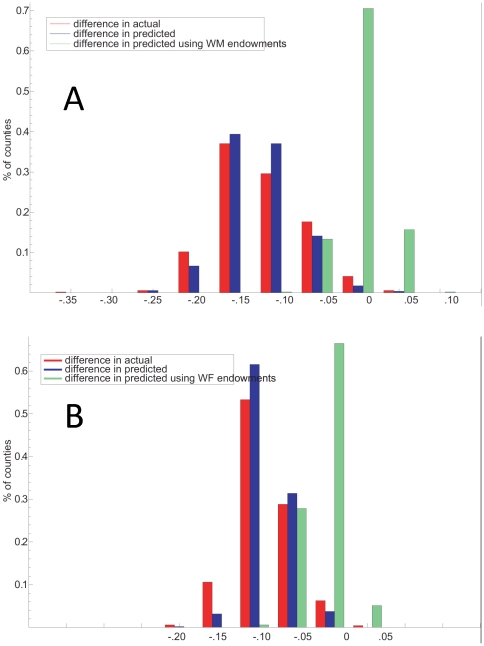
Figure 9. Percent of counties with actual and predicted race differences (black-white) in S70 for men (A) and women (B).
Red and blue bars represent percent of counties (N = 510) with actual and predicted race differences (black-white) in S70 for men. The green bars on each panel represent the hypothetical black-white difference in predicted S70 if blacks in each county were assigned the comparable white value for each predictor variable.

