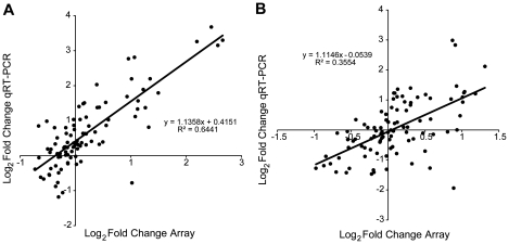
Figure 13. Scatter plot illustrating correlations of array results to qRT-PCR validation.
The expression of 19 genes from five time points relative to SD-long term comparing results using qRT-PCR to results from the microarray are illustrated. Each point represents the group average at a given time point for a particular gene. Results assessing change in expression from the microarray were significantly correlated with results using qRT-PCR in (A) HVC (p<10−5) and (B) RA (p<10−5).

