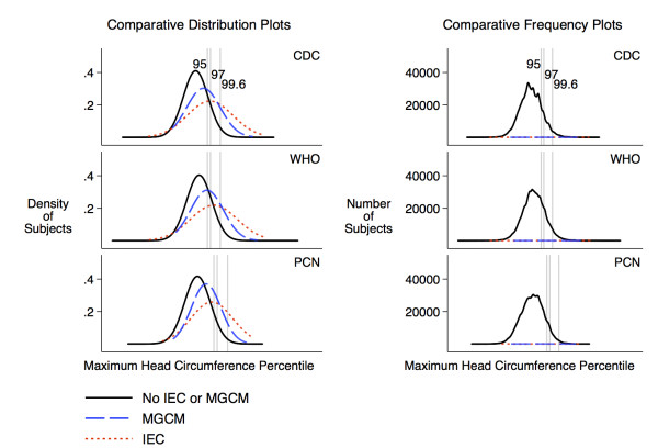
Figure 2.
Distribution of maximum head circumference percentiles by outcome. The gray lines indicate the location of the 95th, 97th, and 99.6th percentiles on the x-axis, which is scaled by z-score. The comparative distribution plots compare the distributions without regard to the number of subjects in each group. The comparative frequency plots (implemented using kernel density estimators) are scaled according to the number of subjects in each group (n = 73,343 for no IEC or MGCM, n = 29 for MGCM, n = 56 for IEC). The fact that the comparative frequency plots for subjects with pathology are flat reflects the small number of children in these categories compared to the number of children without pathology at most percentiles.

