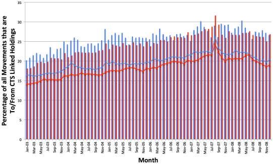
Figure 6. Movements to and from CTS Linked Holdings represented as a percentage of total movements.
This chart shows the monthly movements on CTS that come From (red bars) and go To (blue bars) CTS Linked holdings, represented as a percentage of total movements from and to all holdings over time. For the ‘From’ category, only normal and inferred off movements from agricultural holdings in the VLA_MOVEMENTS table of CTS were considered, whilst for the ‘To’ category, only normal and inferred on movements to agricultural holdings were considered. The blue and red lines represent the percentage of holdings that have a From (blue) or To (red) movement that month and are in a CTS Link.

