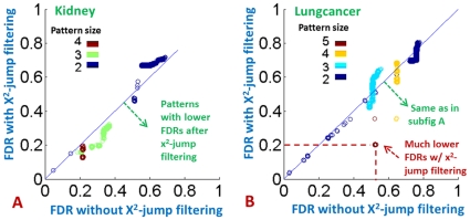
Figure 4. Comparison between the FDRs without  based filtering and the FDRs with
  filtering for the Lungcancer and Kidney datasets respectively.
In both subfigures, each circle represent a SNP combination. There are several circles sitting below the line  indicating that they have lower (more significant) FDR when a
  filtering is applied compared to the case where no
  is used.

