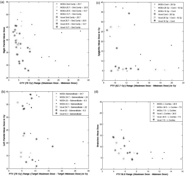
Figure 8.
All four figures compare the results of a 900-iteration optimization using organ-specific genes with the results obtained after voxel-specific-improvement. Three of the 14 decision criteria are plotted on each graph for every plan in each population. The target range is plotted on the x-axis; an OAR mean dose is plotted on the y-axis, and the fitness objective value for a different OAR is shown using color-coding.

